Carlton Lund, a Carlsbad real estate broker and the former chairman of the board of the Carlsbad Chamber of Commerce, invited community members to a public meeting to discuss his proposed 20 feet tall archway sign to be located near Carlsbad Village Drive, and spanning the width of Carlsbad Boulevard, but to Lund’s dismay, he was greeted with more naysayers than he may have expected.
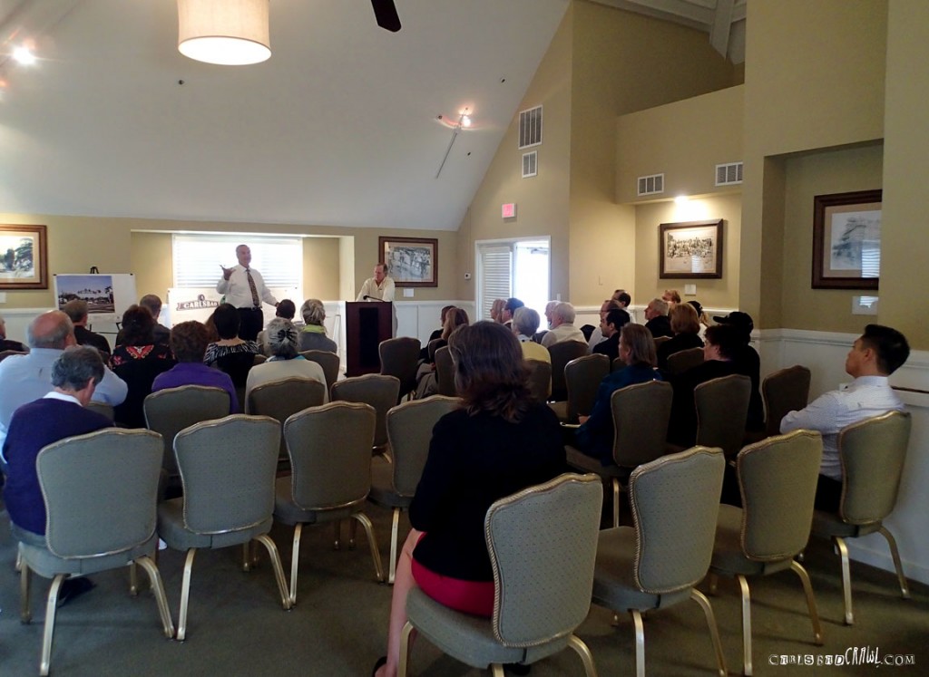
The Village Terrace above the Daily News Cafe in the Carlsbad Village filled promptly at 7:30 a.m. on Thursday, Jan. 30 with representatives from the City of Carlsbad, the Carlsbad Chamber of Commerce, local businesses and organizations, local artists and community enthusiasts.
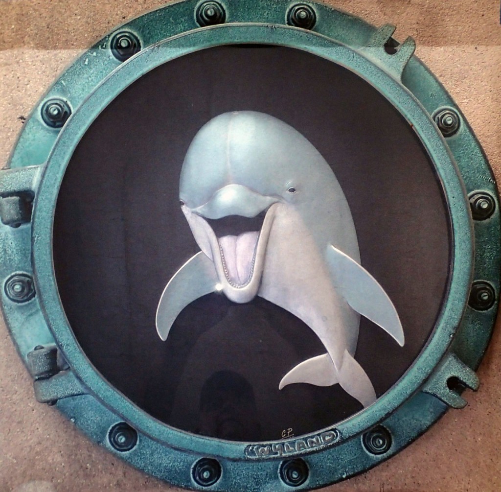
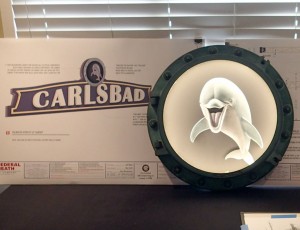 After a short introduction by Chamber member and application handler Mike Howes of Howe’s Weiler & Associates, some attendees’ hands raised high with discontent over what they referred to as a “cartoony” and “silly” image of a smiling dolphin named “Darlene.” This image is planned to sit atop the sign.
While many showed support for a sign in the Carlsbad Village, some disapproved of the image of the dolphin, as well as the “overpowering” size and the cultural significance of the sign, but the most interesting displeasure voiced during this community meeting regarded the definition of “art” and the validation of the chosen artist.
Robert Wyland, a world-famous artist renowned for painting marine life, is planned to donate the artwork for the center of the sign, but many consider Wyland’s image not exactly art. “Dolphin Smile Porthole” is a piece Wyland reproduces often. Some categorized it as merchandise — it has been made available on the Home Shopping Network — and upset attendees considered it more Wyland Galleries branding than a unique piece of art. The City of Carlsbad Arts Commission has already denied support for the same reasoning.
Concerns immediately filled the room questioning the validation of Wyalnd as a representative of Carlsbad. He is not, nor has he ever been, a resident of Carlsbad. Though the icon of a dolphin is appropriate for the Carlsbad Village by the Sea, it is named after his mother Darlene Wyland and vice president of Wyland Worldwide — a name that lacks significance to Carlsbad, its history or its community.
Not all of the community input was negative. Just as many community members showed their excitement for the sign and their support for Darlene the Dolphin. If approved, the sign design, construction and installation, as well as the dolphin sculpture, will be financed by a generous donation of $225,000 by TaylorMade Golf. Of that donation, $50,000 will cover the cost of supplies for the sculpture. The ultimate cost to the City of Carlsbad will be $0.
If approved, this sign will become one of the city’s most photographed landmarks. A question worth asking is why Wyland was awarded the opportunity to stamp his company branding on the sign? A group of local artists questioned why there was not an open invitation for other artists to submit designs?
As a Wyland Foundation member of the board of directors, Lund has pushed for Wyland’s artwork in the past. In the late 1990s Lund attempted to persuade the City of Carlsbad to allow Wyland to paint on the northern wall of the Encina Powerplant. The request was denied.
The meeting began with handshakes, hugs and pleasantries, but to the surprise of the proposed archway sign supporters, the audience was scattered with disapproving looks that passionately applauded after each voiced their concerns of the sign size, the sign location and the aesthetics and iconography of the sign sculpture, as well as Lund’s unwillingness to publicly invite other artist applicants.
Learn more at:
www.feeddarlene.com



While I generally can appreciate wylands art and what he stands for (ocean prservation) this has nothing to do with all of the cultural icons that first come to mind when I think of Carlsbad. And I agree- they should have accepted submissions from local artists and maybe had residents vote on it.
I feel honored that Wyland has time to make such an important contribution to Carlsbad I love the Lunds! We bought our house from them in 1986 Maybe the cute dolphin has to grow on me awhile….
Very interesting! When I first saw the project a few months ago, I loved the idea. I think the sign will put us on the map with Del Mar, Solana Beach, Little Italy and so many of our neighbors with signs such as these. However, I was not aware that there wasn’t an open call to artists. And I can see the point about using such a commercialized image, that seems a little odd. Is Mr. Lund available to work with Wyland about changing the portal creature? I definitely think Wyland is a great asset to have as an artist for Carlsbad! All in all, these are steps in a positive direction. Carlsbad has a beautiful cast of artists and has finally been growing its public art portfolio! Keep us all posted Bryan – Thank you.
That is goofy and why does Carlsbad need a sign?
paying wyland 50,000$ to “sculpt” a version of his merchandise doesnt sound so great.
if it was a unique and community chosen piece, if other artist were allowed to submit ideas…..
I am happy to hear that most Carlsbadians are not going for this silly sign and that my former peeps on the city’s Arts Commission have rejected it. It is not original and there is no Wyland connection to the city. Have local artists apply, just like with any other public art project around the city.
I agree that the image is “cartoony” and I don’t really like it. I DO like the idea of a sign…just think someone could come up with a better image.
reminds me of the one we have in Encinitas
I like the sign, but I saw the dolphin art a couple months ago and thought it looked stupid!! Hope they change it
That would def help me remember what city I am in.
Looks to much like the sign in Encinitas…
Branding a city with a non-residents already established logo (as I understood it) is a very good reason to oppose the sign. Why not just leave it to say carlsbad??
No to the sign and no to Taylormade’s money.
Pretty cool! What do you all think? Better than the bars for sure. (The old “artwork”, not the Carlsbad crawl kind)
It should be put to a city-wide vote! Let public opinion decide which artist will win the project. A local artist would be able to craft a Carlsbad themed piece of art to go with the street sign. City should want to avoid another “Bars” fiasco! A local artist would be preferred by me!
I like it!
I like it! But will like it more if it pisses PETA off! Hahahahahahah
Love the idea of the sign but perhaps with just a little more arch and without the porthole and perhaps a little more artistic supports on the two sides. We deserve a cool sign that speaks to all who enjoy Highway 101/Carlsbad Boulevard and Carlsbad. Let’s be proud, Carlsbad. Maybe the design should be revised a little but we should absolutely have the sign. Just a thought from someone who loves, loves Carlsbad as most of us do who are so fortunate to be able to live and work here. Thanks to the Lunds who have worked for years on obtaining a sign and to the Chamber of Commerce for supporting it and to Taylormade. Have I left anyone out?
I like it. Its very “small town” like- which I like
Wyland is mainstream and doesn’t represent Carlsbad in any way. The port hole makes no sense and the dolphin looks ridiculous. This is “art” that belongs in a La Costa estate, not on a sign that supposedly represents our city. For a sign that isn’t really needed, a simple beach or surfer scene would be more appropriate. I would hate another “bars” situation where the city spends a bunch of money on some art, only to have it removed.
love the idea of the Carlsbad sign. I’ve always said we need one. However, I have to say I’m not a fan over the smiling dolphin. I agree it looks too cartoon like. A normal dolphin would be great, in my opinion.
A nice sign for Sea World, perhaps, but not appropriate for Carlsbad. Recruit local artists to submit their designs just like with any other public art that is put on display throughout the city!
I like the idea of the sign for Carlsbad and I love the Encinitas sign which is quite classy. However, I feel the cartoonish dolphin is completely inappropriate and I agree that if a logo is needed local artists should be involved in a design competition.
I can see why marine life would be an obvious choice since we are so close to the sea, but this dolphin really doesn’t have anything to do with Carlsbad. People know at first glance that we are a city by the beach; I think the sign art should be a little more representative of the city as a whole and the people who make up our huge population. The first thing that comes to my mind is a bird of paradise flower–that’s been a symbol of Carlsbad for so long, and seems much more fitting to be the “logo” of our city on a sign like this. I agree with the idea that local artists should submit designs and have some sort of public vote on the design(or a committee vote) so at least it is local Carlsbad art which is representing our town-not a famous artist who has no relation to this town other than his production of marine-life works of art.on a side note: let’s not debate the merits of the dolphin/porthole as being art or not–Wyland is a world-renowned artist and something doesn’t become “not art” just because it isn’t appealing to some people for certain uses).
This Wyland dolphin can only have appeal for tourists and small children. To not have a Carlsbad artist design this image is an insult to the local arts community.
I am not at all impressed by Wyland’s art on the sign. I’d prefer something more unique to Carlsbad and would support a local artist being given the opportunity. The city logo would even be better than the ridiculous dolphin!
i dont like the idea of one single image trying to encompass all that carlsbad represents. if anything, the encrouchment of growing cities has had a horrible effect on wildlife, and we have less dolphins now than ever before. the image, if any at all, should be of a Luiseno indian.
I like the bird of paradise idea
Could it be any less original ! Like the sign idea but really see no necessity for it ! If so let it be open to All local creative artist to submit Their ideas ! Dolphin is CORNY IDEA Sooooooo Uncreative
As someone who had lived in Carlsbad my whole life, I am not thrilled with the sign at all. It looks as if we are trying to copy other cities. However, if the sign is a for sure thing, I do not agree with the dolphin. A sculpture to go along with it may just turn into the “Cardiff Kook.” Something for people to poke fun at and decorate. Does a dolphin represent Carlsbad and the people living in it? Not at all! What about showcasing some of our local culture? Strawberries, flower fields, our city flower, the trails, our spring water, etc. Focus on the “real” Carlsbad, not the commercial aspect. Our city has a lot to offer, sure the beach is a large part, but are we just a tourist city? or do we want to provide a sign that the Local population who lives here all year long will be proud of and enjoy?? The city needs to go back to the drawing board on this week and not let a “special interest” dictate what will happen in “our” city.
I’m an artist and a neighbor from Encinitas. I like the whole sign idea, but seriously, why wasn’t this vetted out to the entire Carlsbad art community, maybe as a competition?!
Carlsbad is FILLED with very talented artists! So it seems to me that this important art piece could at least have been a juried selection of locals – and expanded outward if none of the local artists made muster (which I would find VERY hard to believe!).
Best wishes, – Mark Patterson
I agree with you; as always, Carlsbad sells out to commercialism and not what is best for Carlsbad or those who live here and pay taxes. We’ve lived here since 1985 and this is just another indication of that, along with loss of open space and decimation of our animal populations. We need someone like Bryan Snyder to run for public office.
At first, l was ambivalent about the smiley dolphin, but it’s now starting to get on my nerves. For one thing, it’s not even a very good dolphin likeness. Looks more like a beluga with an eye infection.
Very corny dolphin. Why can’t we just have a nice curling/crashing wave in that circle? The dolphin is not awful, just not worth $50,000, in my opinion.